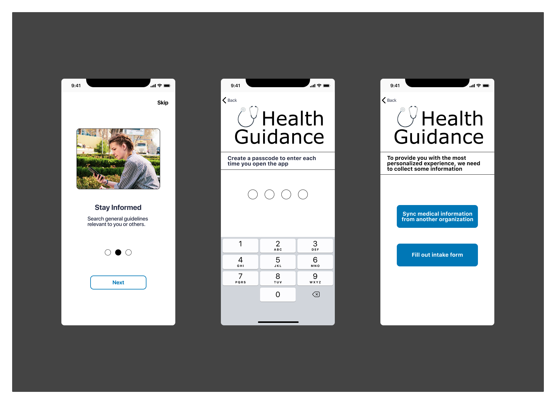
Health Guidance
A mobile application to help patients find healthcare providers and learn about health conditions and treatments.
Overview
Role
Researcher, UX/UI Designer
Timing
January - June 2021
Tools
Miro, Optimal Workshop, UsabilityHub, and Figma
Methods
Research, affinity mapping, personas, information architecture, card sorting, usability testing & analysis, prototype
Challenge
Patients need a more intuitive way to engage with healthcare; studies show more engaged and informed patients lead to better health outcomes.
Outcome
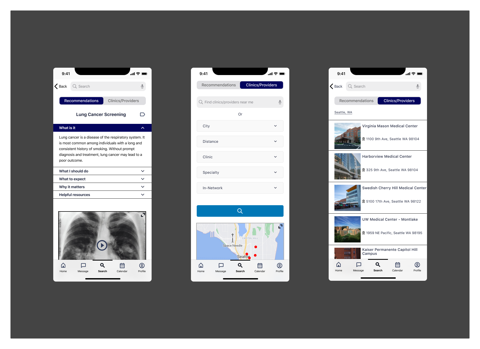
A mobile application to help patients learn about personalized healthcare conditions and treatments to improve outcomes. Patients can also search healthcare providers and schedule appointments from their phone.
*Student Project
Competitive Analysis
Digital health has grown over the years and the COVID-19 pandemic accelerated the growth exponentially. To gain a better understanding of what solutions already exist, I conducted a SWOT analysis of two telemedicine mobile apps by Lemonaid Health and Teladoc.

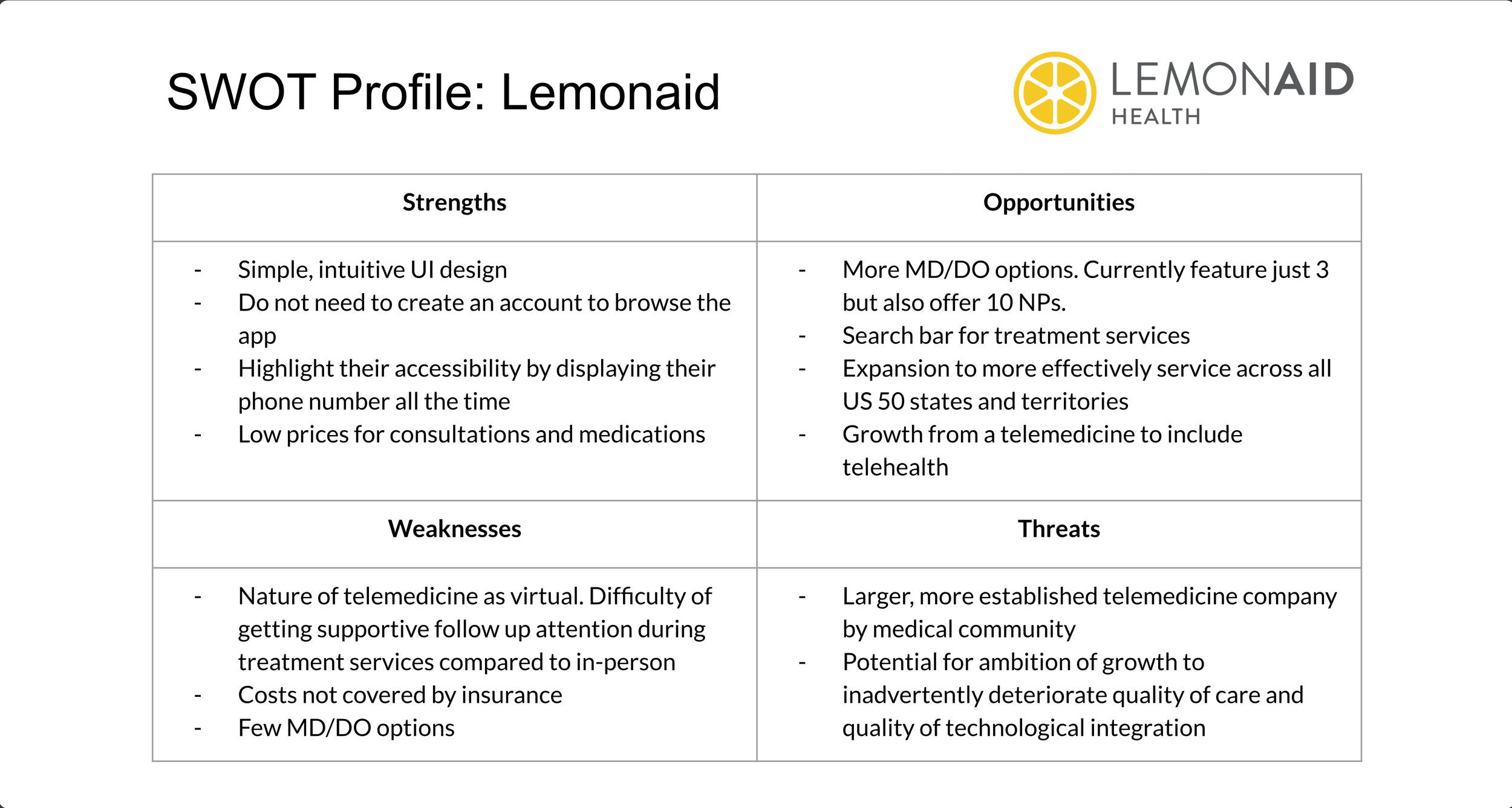
Both apps provided an option for patients to meet with a provider via virtual appointment. This makes immediate care more accessible for patients. I also found that both experiences were designed to have more of a focus on reactive healthcare rather than preventive healthcare.
User Research
It was important for me to gather user research through surveys and interviews to better understand how patients currently engage with their healthcare. I used both research method because each one has its pros and cons. Surveys allowed me to reach more users to obtain quantitative data. Interviews created opportunities to elicit a greater amount of information through conversation.
After interviewing 3 participants and surveyed 20 participants within the age range of 24-60 years old, I analyzed the data by creating an affinity map. Further findings are summarized below:
Surveys:
75%
of participants did not know when to go in for their next preventative healthcare screening
85%
of participants appreciated the ability to video chat with a provider
75%
of participants did not know what preventative healthcare screening to consider
Interviews & Surveys:
Patient healthcare needs are unique and individualistic
Beliefs and preferences about how often to see a healthcare provider vary among patients interviewed
Overall, interviewees desired to be more engaged and informed of specific healthcare recommendations and guidelines
Understand the Problem
88,000,000
American adults have prediabetes
Risk of type 2 diabetes can be reduced by 50% with appropriate interventions.
* Center for Disease Control and Prevention
200,000+
New cases of lung cancer every year
Early detection can decrease mortality by up to 20%.
* American Lung Association
User Personas
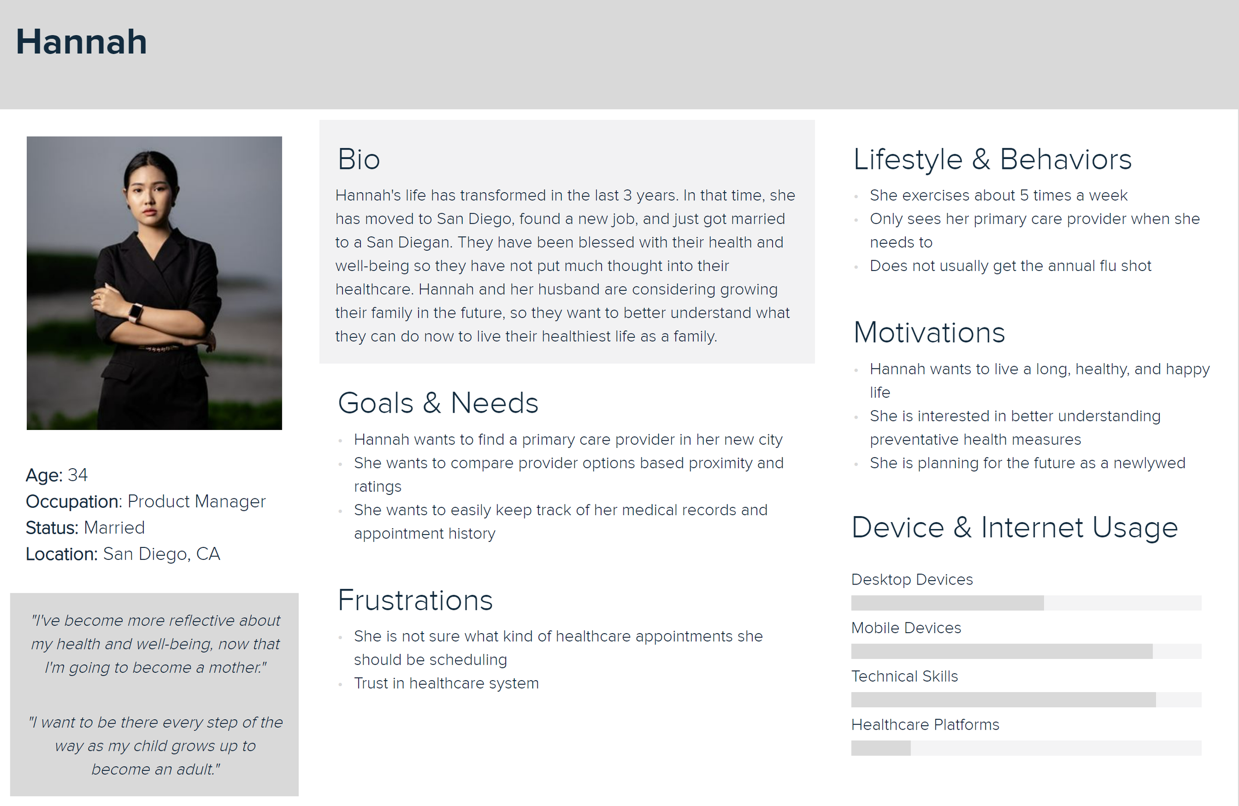
With a better understanding from my research findings and analysis, I created two user personas with different needs and goals to help guide through product development. Soren has type 2 diabetes and wants to keep a close eye on his health. Hannah just moved to a new city and is looking for a new provider.
Ideation & Testing
Ideation started with creating user flows focused on 3 main functions: onboarding, searching for healthcare guidelines, and searching for a provider. Then I bright it to life by designing mid-fidelity wireframes before tying them together into a prototype.
In conducting a remote, moderated usability test with six participants, I placed the healthcare app in the hands of users to:
Determine if participants understand the purpose of the app
Observe how participants navigate through the prototype
Understand participants’ perspectives on usability and utility
Key Findings
Order of operation is essential to a smooth onboarding process. I had to re-design and organize the onboarding wireframes
Navigating to "Search" for personalized recommendations was not as intuitive as I originally thought
People value privacy and healthcare data security. I need to remember this as I scale up my design
Results and analysis were tracked through a usability test report and rainbow spreadsheet.
Refinement
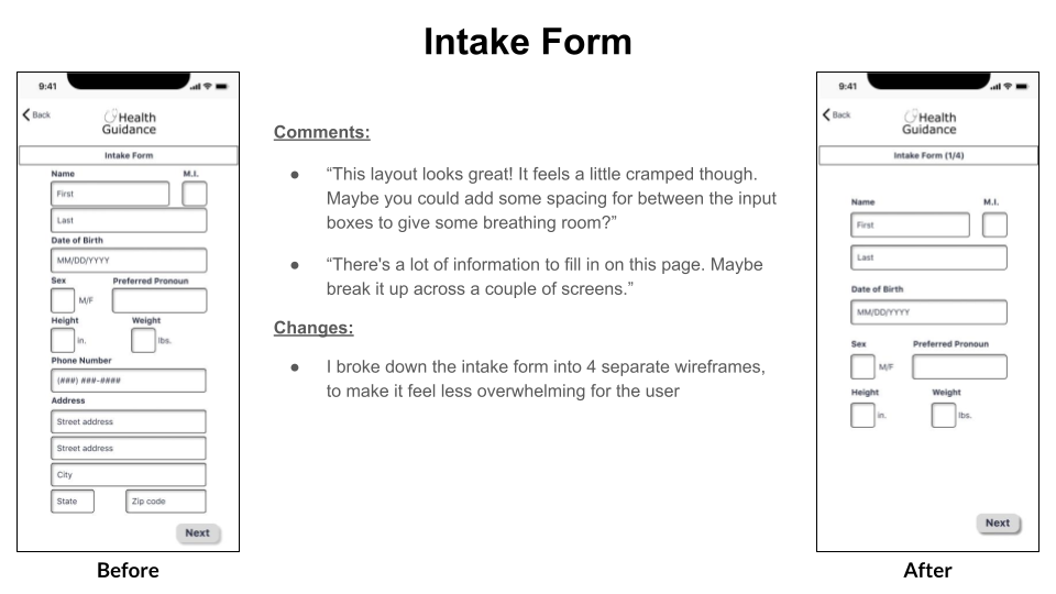
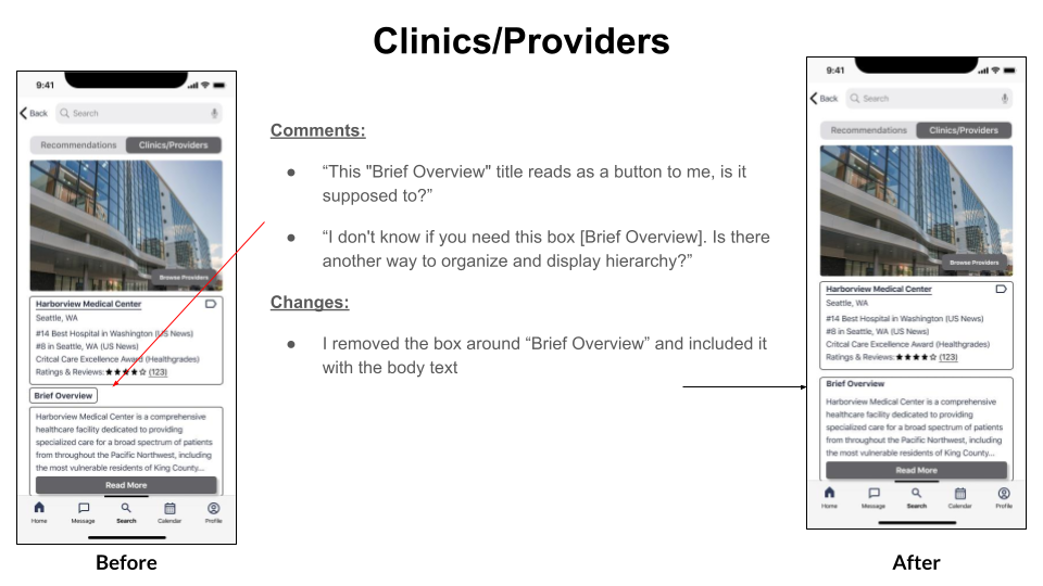
With feedback from the usability testing, it was time to implement changes and scale it up to a high fidelity prototype. This iteration was about cleaning up the content and UI while referring to the Human Interface Design Guidelines. An important next step for me was design critiques. Feedback from five peers and senior designers pointed out areas of improvement in layouts, hierarchy, and design accessibility which help my apply finishing touches to the final product.
