LifeShop
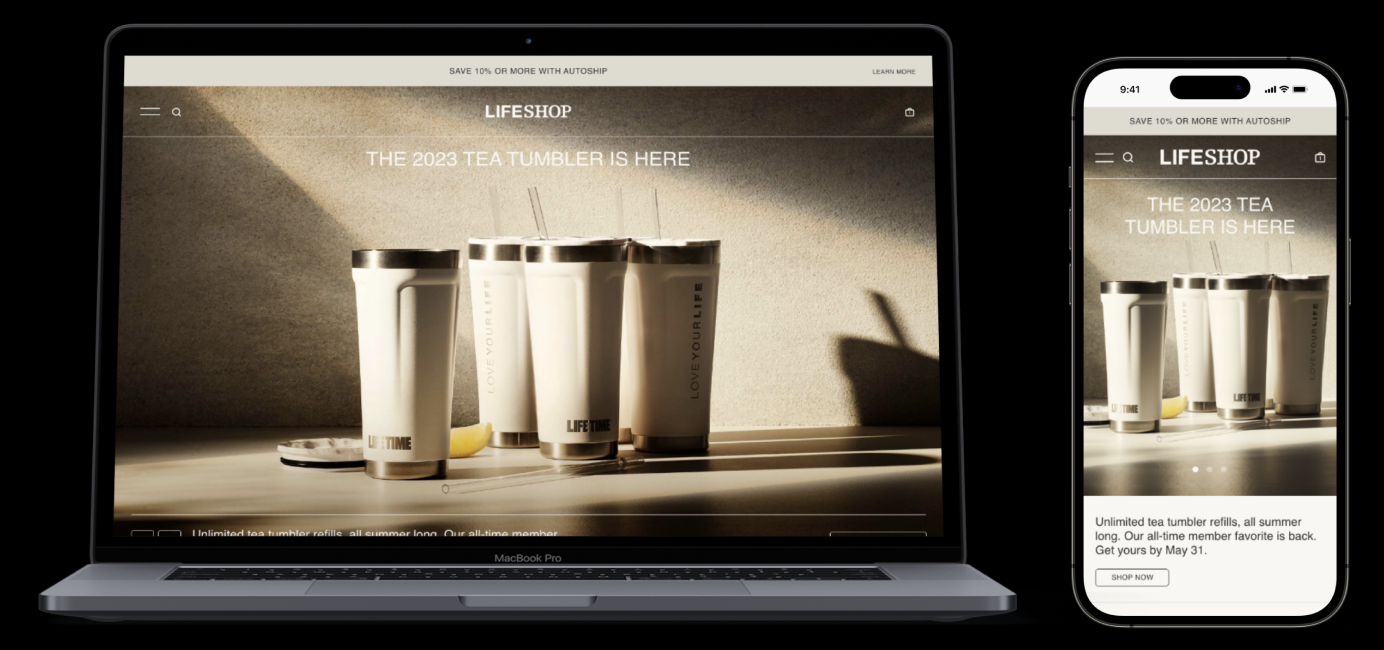
A redesign of Life Time Inc’s e-commerce website, focused on improved UX and brand elevation, resulting in a 15% YoY sales growth in 2023 and renewed interest from company leadership unlike ever before.
Overview
Role
Product Designer
Timing
Launched May 2023
Tools
UserTesting.com & Figma
Challenge
Reconsider Life Time’s e-commerce business unit’s UX in parallel with new branding and repositioning as a luxury athletic country club.
Outcome
A redesigned user-friendly, business-oriented landing page that aligns with the company’s branding ambitions.
Impact
15% YoY sales growth 2023 and reinvigoration from leadership to further prioritize and invest in the development of LifeShop.
Background
Following the pandemic, Life Time has been on a mission to reposition itself as a luxury athletic country club. Part of this mission has included a complete digital design transformation to match the premier impression through all digital touchpoints including LifeShop, Life Time’s e-commerce business division. LifeShop represents a small part of the company and therefore is often overlooked. The website had not been updated since 2019 and it shows as it falls short of usability, product findability, visual design and responsive design. The LifeShop design worked, but the evolution of the company into the luxury space calls for an evolution of its e-commerce experience as well.
Research
Heuristic Evaluation
In conducting a heuristic analysis, I noticed a number of concerns:
Landing page
The page didn’t create a sense of luxury or excitement, nor did it quickly provide a unique reason to buy. Why shop LifeShop among a sea of other similar competitors?
Responsive design & hierarchy
This iteration featured two options to promote time-relevant products and services: tiles and the banner ad. On mobile, the banner ad disappeared. Users would not find it unless they opened navigation and scrolled to the very bottom. With 85% of traffic coming through mobile, these usability issues had considerable negative business impact.
Discoverability
There were limited opportunities to see other products and in-club experiences across the entire purchasing journey.
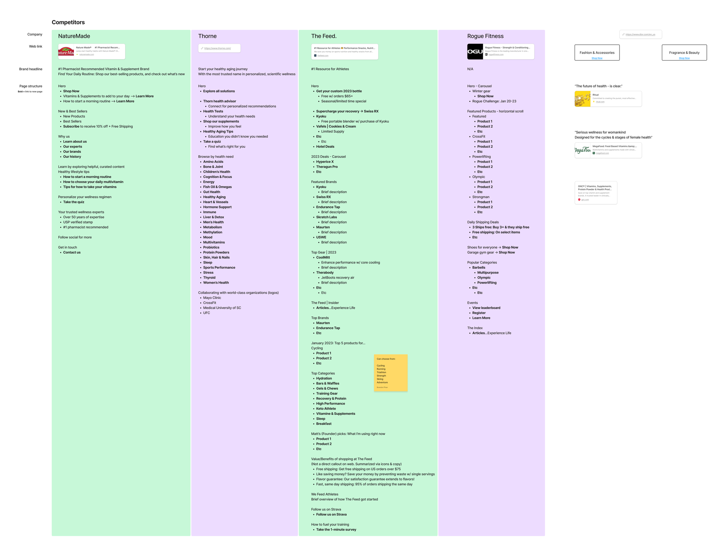
Competitor Audit
In addition to a SWOT analysis I also reviewed content strategy and page hierarchy across competitors. Primary takeaways:
Highlight a wide variety of products in different ways
Clear communication how their company is unique, ie value proposition
Lean into their unique "why" in order to facilitate brand trust
How might we facilitate product and service discovery throughout the user journey, starting with the LifeShop home page?
The Process
Wireframe Ideation
Leveraging new and past research findings, a few important design decisions I pushed for in this design included:
Omnipresent rotating pencil-banner ad
Entry points into LifeShop vary. Users arrive here from different channels including Experience Life, emails, social, in-club signage, and more. While they were driven to a specific page for a specific reason, why not also promote other time-relevant details while they're in the e-commerce ecosystem?
Rotating hero section
Provide reason and excitement for shoppers to come back. Position the home page as a source of discovery and awareness. What new products or partnerships just launched? What new services are now available? How about sales?
Meeting member and shopper expectations
People shop in different ways. How might we support members in their shopping journey based on existing mental models? How might we balance copy with imagery? Why shop LifeShop? The vast majority of our audience are Life Time members. What are their specific fitness goals and how might we support their fitness journey?
Collaboration
The next step was co-presenting the wireframes with the ecommerce business team to the creative team. This was an opportunity to articulate the why behind certain design decisions. The creative team was then responsible for scaling the wireframes up to final design with components being considered for the new design system.
The creative team delivered beautiful aesthetic designs ready for handoff to development. However, my team noticed and voiced important usability issues that needed to be addressed. Discussions came to a stand still so this felt like the appropriate time to conduct a usability test.
Usability Testing
Conducting a moderated usability test with six participants (requirements: (1) prior online shopping experience and (2) existing Life Time member) confirmed many of the concerns suspected. In line with Jakob's Law, participants found placement of utility navigation, logo, and inconsistencies with responsive design counterintuitive. These challenges led to added time on tasks and confusion.
Design Handoff and QA
Sharing the research findings proved fruitful in persuasion. We compromised and delivered on what each team wanted: aesthetic and usable. The final steps consisted of working closely with the creative design team to get the updated handoff files for our developers. Then conducting QA before and after page launch.
Leadership Takes Notice
It did not take long for senior leadership and the CEO to take notice of the value being presented. Within weeks, LifeShop went from an often overlooked business unit to high priority, high scrutiny business with fresh, aggressive objectives for the remainder of the year. Renewed enthusiasm led to an change in business approach unlike ever before.
Next Steps
Tackling the roadmap for the entire e-commerce experience including taxonomy, navigation, search, product description pages, product listing pages, cart/checkout, launching the loyalty program, and more
Continued partnership with the Product Manager and channels in strategizing marketing efforts
Continuous refinement with our development team

